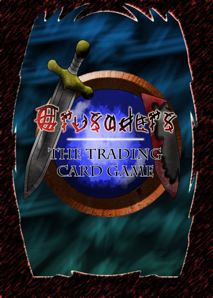
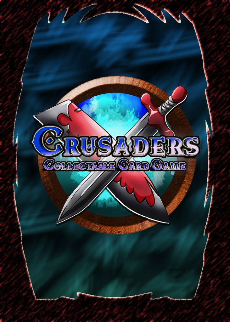
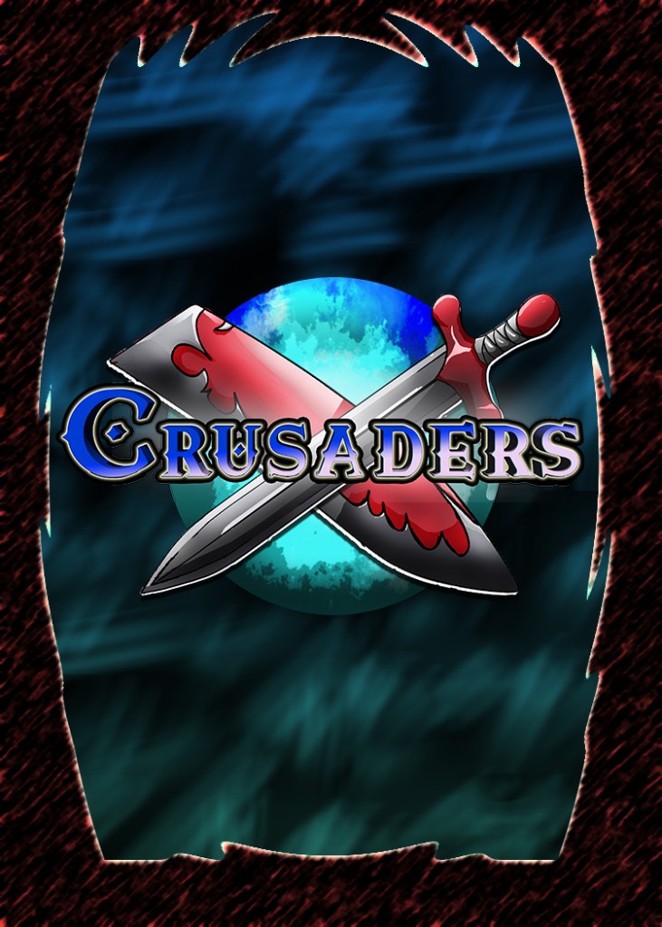
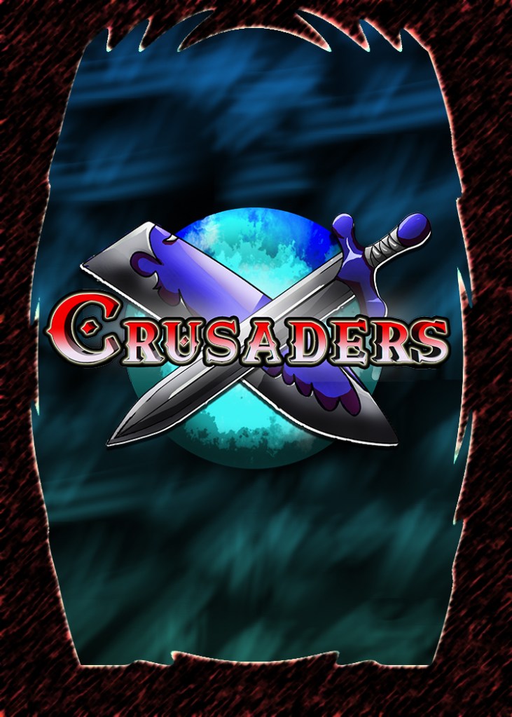
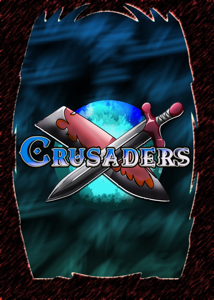
The design of the rear faces of the cards has been stagnant. I am to blame. I was too attached to the oldest version from quite a few years ago. It suffered from low readability and a lack of connection to the updated style and themes, especially after the redesign around the first volume of the Book. We have settled on new images and color schemes and are quite pleased with the final. Also, we have updated the site logo as well
